The new tricks and tools in Excel 2007 include dashboards that you can engage and add to your worksheets. Although Excel reports aren’t exactly new to the 2007 edition, some of the designs and features are, as are some Web sites that explore and expand upon the available options.
>
>
Dashboard Icons for Excel 2007
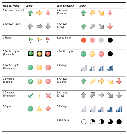
Excel 2007’s dashboards and reports offer some new conditional formatting rules that allow you to add icons to your dashboards. With Excel 2007 icons, you can represent and distinguish values from one another by using different shapes and colors. The following table shows the Icon Sets that come with Excel 2007.

If you’re working in an environment where not everyone has Excel 2007, definitely avoid using Excel 2007’s Icon Set conditional formatting. Why? Icon sets aren’t backwards compatible, so anyone who doesn’t have Excel 2007 can’t use them.
>
>
>
How to Substitute for Icon Sets with Excel 2007
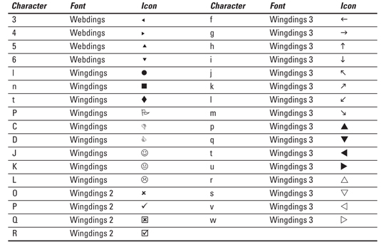
A creative alternative to using the icon sets offered with conditional formatting in Excel 2007’s dashboards is to use the various symbol fonts that come with Office. The symbol fonts are Wingdings, Wingdings2, Wingdings3, and Webdings. Each character/font combination shown in the following table displays an icon that can be used to represent a value in your dashboard.

>
>
>
Helpful Web Sites for Excel 2007 Reports
The dashboards and reports of Excel 2007 offer a wide range of Excel tools, and it’s always nice to see the approach others take to design their reporting mechanisms. The following Web sites (in no particular order) are dedicated to business intelligence and the presentation of data through dashboards. You can use these sites to get ideas and fresh new perspectives on dashboards and reports.
The Dashboard Spy posts examples of business intelligence dashboards, pointing out examples of good and bad dashboard design. This is a virtual warehouse of dashboarding ideas.
The instant cognition blog offers loads of articles on the latest visualization and Web analytics trends. You’re sure to get plenty of ideas from the wide array of topics presented at this blog.
Zach and Chris Gemignani of Juice Analytics use their site as a platform to critique charts and offer interesting ideas around reporting data.
At Perceptual Edge, visualization expert Stephen Few provides some fascinating insights on data visualization and dashboarding. A generous amount of articles and examples can be found at his site and his blog.
An icon in the field of information design and data visualization, Professor Edward Tufte shares his thoughts about visual communication in a series of articles at his site. Although many of these ideas are academic in nature, they’ll get you thinking in new ways about how to best present data.
Although Peltier Technical Services, Inc. isn’t a site dedicated to dashboarding, Jon Peltier offers over 200 pages of unique and effective Excel charting ideas. A quick look at the excellent tutorials posted on his site will have you reeling with new ideas on how to chart your Excel data.
>
>
dummies
Source:http://www.dummies.com/how-to/content/excel-2007-dashboards-reports-for-dummies-cheat-sh.html
No comments:
Post a Comment