Web design can be technically demanding, but don't underestimate the importance of the visual aspects. How your Web pages look — whether you're presenting pure information or adding navigation tools — has a great influence on how long visitors stay on your Web pages. So it pays to pay attention to design elements to achieve graphic good taste.
>
>
Basic Web Design Tips
When designing web pages, you need to think visually. A web site designed with a good balance of graphics and text is pleasing to the eye, attracts viewer attention, and holds it. Good web design relies on the artist — in this case, you — following certain design principles:
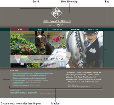
Design the web page interface to fit within the first 800 x 600 pixels so that the important content is visible when the page first loads. Although most modern monitors are much larger than this, many people browse the Internet through laptops and devices.
Achieve a balanced layout by designing no more than three focal points: Use the "big, medium, small" strategy.
Avoid using fonts smaller than 10 point (depending on the font).
Use standard computer system fonts for all HTML text, or be sure to embed a specialty font using CSS or other technology.
The following figure puts these principles to practice:

>
>
>
Web Design Tips for Graphics
Graphics are a huge part of web design. Knowing and using the standards and formats for different types of web graphics can mean the difference between a web page that catches attention and one that browsers glance past. Use these tips to make sure your visual elements are visually arresting:
Build all web graphics in 72 dpi, the standard display resolution of the web.
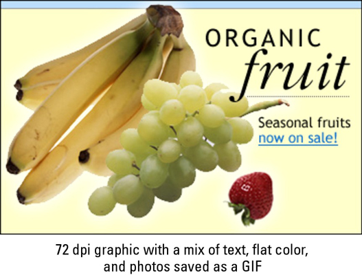
For best download performance, save graphics that have a mix of text, flat-colored graphics, and photos, such as the one shown here, as adaptive palette GIF files that use as few colors as possible.
Save all purely photographic images as JPEG files. (PNG files work as well but are typically larger in file size.)
Always display anti-aliased graphics that use single color transparency (such as GIFs) on the correct background color; otherwise, you see an unsightly halo around them.
To achieve a soft transition from an image to a transparent background, use the PNG format. The PNG format supports alpha channel transparency.

>
>
>
Web Design Tips for Presenting Information
As you design web pages, think graphically even when all you're presenting is pure information. Good web page design means you present information by organizing it logically and making it visually attractive. Use the following tips to keep browser eyes on your information pages:
For large sites, prioritize and group navigation into a primary, secondary, and tertiary set, each containing no more than five to seven top-level choices.
Ideally, build your site outline with no more than three levels: Main idea, topic, and subtopic.
Choose a standard set of symbols for the site map. Use boxes to represent pages, cylinders to represent databases, and then connect everything together with lines and arrows.
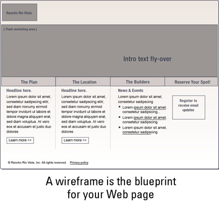
Build wireframes for each unique page layout in your site to detail the interaction design and content display. It’s important that they do not convey anything that can be misconstrued as a visual design look and feel. They should stay nice and boring. Wireframes act merely as a diagram view of your page layout and interaction, like the one shown here:

>
>
>
Web Design Tips for Navigation Tools
In web design, consider the visuals when you include the navigation tools that take visitors from page to page. When designing web page navigation tools, you need to make them attractive as well as functional. These tips can help you do that:
Differentiate the visual design of non-clickable and clickable elements. For example, don’t use the same graphic as a button on one page and a headline on another. Or, don’t underline headlines and color them like links if they are just headlines.
Use visual design and feedback to enhance interaction and usability. For example, you can change an item’s color, size, or shape upon rollover. (The following image shows how a color change would look.)
Always place navigation in the same location on the page and don’t change its appearance.
Always label icons. Illustrations by themselves are not always clear as to their function.

>
>
dummies
Source:http://www.dummies.com/how-to/content/web-design-for-dummies-cheat-sheet.html
No comments:
Post a Comment