Admit it — 3-D charts in Excel look really cool! Working with 3-D charts in Excel requires merely a basic understanding of height, width, and depth. The 3-D View dialog box lets you change the 3-D settings. You can access that dialog box by selecting a chart and choosing Chart --> 3-D View. (The Apply button in the 3-D View dialog box lets you see how your settings affect the chart without having to close the dialog box.)
Note that the 3-D View menu item is available only when the selected chart is a 3-D chart. If the 3-D View menu item is disabled, first change the chart type to a 3-D type by choosing Chart --> Chart Type.
Not all chart types are available in a 3-D subtype, and not all charts that are available in 3-D have all the same settings.
Spin doctor
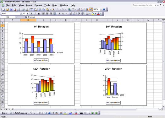
Rotating an Excel chart moves it left or right. A complete 360 percent of rotation is available for all 3-D charts, except the Bar chart. Figure 1 shows a chart formatted with different rotation settings.
>

Figure 1: You can rotate your chart left or right.
The charts in Figure 1 respectively have 0% rotation, 60% rotation, 120% rotation, and 270% rotation. Here are some important points to consider:
- The 0% rotation view is acceptable because the frontmost series is smaller than the series behind it. If this weren't the case, the series in the back would not be seen. (An adjustment of the elevation or changing the series order could compensate for this.)
- The 60% rotation view serves this data well because both series are easy to see.
- The 120% view hides most of the lesser-valued series. This is not a good situation.
- The 270% view does not create a conflict of the two series, but instead makes seeing all the data points within each individual series possible. Even adding a change to the elevation setting will not help much.
Rotation values of 0%, 90%, 180%, and 270% often obscure data.
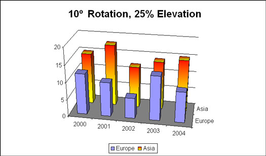
Figure 2 shows a mix of rotation and elevation that work together to present the two series. The rotation is set at 10% — more or less a nudge away from looking at the data flat on. The elevation is set at 25%.
>

Figure 2: Using rotation and elevation together.
Here's how to adjust the rotation of a 3-D chart:
1. Create and select a 3-D chart, or open a workbook with a 3-D chart and select it.
2. Choose Chart --> 3-D View.
The 3-D View dialog box appears.
3. Adjust the rotation setting.
Refer to Table 1 (at the end of this article) to see which values can be used.
4. Click OK to close the dialog box and see the change in the chart.
Although you can adjust the rotation of a Pie chart, the effect does nothing other than to spin the pie around; it doesn't make it any easier or harder to see data slices.
Adjusting the perspective
Picture a classic example of the perspective effect: parallel lines that seem to come together in the distance.
Perspective provides charts with an effect of objects that are closer appearing larger and those that are farther away appearing smaller; in other words, perspective can add depth to a chart. This, of course, simulates the way you see things out in the world. Charts don't necessarily need this treatment, but it is available for you to use.
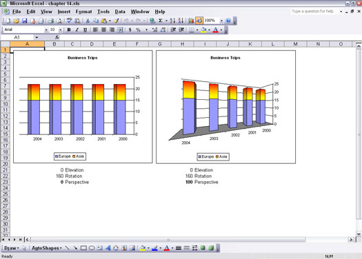
Figure 3 shows the same Column chart plotted twice. All settings are the same except for perspective:
- The chart on the left has a perspective setting of 0. All the columns are the same size, and there is no perception of depth.
- The chart on the right has a perspective setting of 100 (the maximum setting). The columns seem to shrink in size, looking from front to back.
>

Figure 3: Comparing perspective settings on a Column chart.
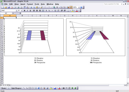
The charts in Figure 3 show the perspective as applied to a series of data points (the columns). Figure 4 shows another example of perspective. The same Line chart is plotted twice. The chart on the left has a low perspective setting of 30. The chart on the right has a full perspective setting of 100. The lines in the chart on the right seem to be heading slightly toward each other. This is a common depth perception, such as when railway tracks seem to converge in the distance.
>

Figure 4: Comparing perspective settings on a Line chart.
The use of perspective can work against you. As shown in Figure 3, the use of perspective makes it seem that the data points are not equal in value, although in fact they're identical.
Here's how to adjust the perspective of a 3-D chart:
1. Create and select a 3-D chart, or open a workbook with a 3-D chart and select it.
2. Choose Chart --> 3-D View.
The 3-D View dialog box appears.
3. Adjust the perspective setting.
Refer to Table 1 to see which values can be used.
4. Click OK to close the dialog box and see the change in the chart.
The types of settings that are applicable to 3-D charts are summarized in Table 1.
Table 1: 3-D Attributes
Setting | What It Does | Possible Values |
Elevation | Adjusts the over and under view. | –90 to 90 for Column, Line, Area, and Surface charts; 0 to 44 for Bar charts; 10 to 80 for Pie charts. |
Rotation | Adjusts the left and right view. | 0 to 360 for Column, Line, Pie, Area, and Surface charts; 0 to 44 for Bar charts. |
Perspective | Controls the effect of the closer part of a chart appearing larger and the farther part of a chart appearing smaller. This effect could be an enhancement or a detriment to the appearance of a chart, depending on how the effect appears given the settings for the other 3-D attributes. | 0 to 100 for Column, Line, Area, and Surface charts. The effect is not available for Bar or Pie charts. |
Right-Angle Axes | Overrides the perspective effect and forces the x-axis and y-axis to meet at a right angle. When the Right-Angle Axes box is checked, the option to set perspective is not visible. | As a check box, available for Column, Line, Area, and Surface charts. |
Height % of Base | Controls the height of the 3-D data series. The setting works by gauging the height of the series as a percentage of the base of the chart floor or plot area. | 5 to 500 for Bar, Column, Line, Pie, Area, and Surface charts. |
Auto Scaling | Overrides the Height % of Base setting. When applied, Excel adjusts the height and width ratio. | As a check box, available for Column, Bar, Line, Area, and Surface charts. |
>
dummies
Source:http://www.dummies.com/how-to/content/rotating-a-3d-excel-chart.html
No comments:
Post a Comment