Grab some Tylenol. You're about to delve into the rather confusing and sometimes cantankerous world (or as some users would call it — underworld) of color management. It is, by far, the biggest headache of every graphics professional's day-to-day experience. And quite a few home users also scratch their heads wondering why their digital photo looked so great on-screen and turned into a muddy mess on paper.
Reproducing color is not an exact science. In fact, sometimes you would think it takes an act of voodoo magic to get the output you want. Don't throw up your hands and live with whatever output comes out the other end; if you can't change the color, you can at least change your attitude toward color. Getting a handle on color management requires four things — some knowledge, some patience, a significant amount of time to experiment and test, and, most importantly, acceptance. Acceptance of the unfortunate fact that we don't live in a WYSIWYG world. What you get in one medium is sometimes merely an approximation of what you see in another.
Why? Well, let's start with the basic gripe of many users as they look disapprovingly at their printout — "But it didn't look like that on the screen!" There are two major color models — RGB (Red-Green-Blue) and CMYK (Cyan-Magenta-Yellow-Black). The RGB color model (16.7 million colors), which all monitors use, has a significantly wider range of color (called a gamut in computer lingo) than the CMYK color model (approximately 55,000 colors) that is used by printers. The result is that many of the colors you see on-screen fall outside the CMYK gamut and therefore cannot be reproduced on paper. And in some cases, some CMYK colors fall outside the RGB gamut. Programs such as Photoshop try to do their best by providing colors that are the closest match. But those bright and vibrant colors that are out of gamut are matched with duller, darker versions at best.
And if that difference alone isn't enough to complicate matters, hardware devices that share the same color model can possess different gamuts within the same color model. For example, the RGB color space of a monitor can differ from the RGB color space of a scanner. Not only that, but you can also have different color spaces within the same type of device. A 15-inch generic monitor won't display color equal to a 21-inch Sony Trinitron monitor. Likewise, an Epson printer may not share the same color space as a Hewlett-Packard or Lexmark printer. So when you take into account the differences that can occur between platforms, monitors, printers, browsers, scanners, applications, paper and other substrates, or any of the almost infinite number of possible permutations, it makes you want to return to the days of quill and parchment. Techies often call this mind-numbingly large number of possible inconsistencies device-dependent color. In other words, the color is dependent upon the hardware device. And device-dependent color varies. That's just the cold, harsh reality, and nothing's changing that.
But Adobe, being the kind and benevolent software mega giant that it is, has developed (first introduced in Version 5.0) a color management system designed to be device independent. The five-cent explanation of this system is that you first identify your working color spaces. Photoshop then tags your files with that color space by embedding a color profile (also known as an ICC profile) with your files. The program then analyzes any color space in which you either view or output a file and makes adjustments on the fly so that the color is viewed and printed reasonably accurately and consistently, in theory, independent of the device. Photoshop also reads the embedded color profile (or lack thereof) of any file you open and addresses how you wish to deal with that profile if it doesn't match your working color space.
Setting up your work environment
One aspect of color management that people often overlook is setting up a good working environment for digital image editing. You may wave your hand impatiently and say, "Yeah, yeah, I just want to get to the important stuff." This is the important stuff.
Don't worry. Setting up a good work environment won't cost you anything. Just do these things:
- Always keep your computer desktop a neutral gray. Sure, having dancing bears and family photos in the background is tempting, but these elements don't contribute to a good viewing environment. Colors and patterns behind your images influence the way that you view those images. Creating a neutral, gray desktop is the closest you can get to mounting your work on gray, black, or white mat board (and not neon green or paisley) the way professional graphic designers and photographers do.
- Keep your lighting as consistent as possible. Avoid working on or viewing images in full, bright afternoon sun and then again under a single desk lamp late at night. Keep the level and intensity as consistent as possible, and be sure to look at your source material, along with the images you're working on, under the same intensity of light. Likewise, view on-screen images and your printed output under the same lighting, thereby establishing a consistent benchmark to use in your Photoshop editing sessions. Variations in lighting can cause you to perceive color differently and can then lead to color shifts in your output. And whatever you do, please, no disco balls.
- If your desk is next to a window, you may want to invest in a monitor hood or visor to cut down on screen glare and reflections. They run around $15 to $100. And if you find you really want an optimum lighting situation, you can look into a couple of additional devices. Task lamps provide consistent full spectrum light and enable you to see color with more accuracy and clarity. They run $50 to $200 and even help to cut down on eyestrain. A light box (or light booth or color viewing booth) offers various lighting environments, from fluorescent to daylight. Professional grade light boxes adhere to lighting standards developed by ISO (International Standards Organization). They allow you to view images in a consistent and controlled environment. Depending on the make and the model, the cost of a light box ranges from a few hundred dollars to several thousand.
- Keep the walls of your work environment as neutral as your monitor desktop. You don't have to paint your office gray, but try to avoid lots of colorful posters and artwork in your direct line of vision (around and behind your monitor).
- Speaking of monitors, if you are using an LCD (flat screen) monitor, rather than a real-estate hogging CRT monitor, be sure you are sitting directly in front of it, because color shifts quite a bit on LCDs if you are viewing it at even a slight angle. So no slumping in your chair!
- And because you shouldn't slump, for many reasons, make sure you have a comfortable desk and chair. Let's be honest, if your back or neck is screaming with pain while you are trying to edit an image, you won't last long. Invest in a chair with good support. If you experience wrist or hand strain, check out those squishy gel pads for your mouse and keyboard. It is amazing how much those little buggers can help.
- For print work, keep a swatch book (or two) handy, such as those from Pantone or Trumatch, to choose your colors. Don't make a decision based on what you see on-screen. These books give you a true representation of how color looks when printed on paper.
- Get a swatch book that shows both spot (premixed inks of a single color) and process colors (colors made by mixing the four process colors — Cyan, Magenta, Yellow, and Black [CMYK]).
- Be prepared for a healthy monetary investment when you buy a swatch book. These little buggers can cost anywhere from $75 to $200 and need to be replaced over time as the colors can fade. Keep them in a dark location to extend their life span. You can purchase swatch books from some larger art supply stores or order them online. You can purchase Pantone books from www.pantone.com. Do a search for others such as Trumatch, Focoltone, and Toyo.
- If you buy imaging or printing services, do spend some time finding the best service bureau and printer in your area and develop a good working relationship. Most likely, you'll run into a digital color expert or two hanging around. You should also stick with that vendor for all your products — scans, prints, Kodak Photo CDs, slides, and so on. You'll know what to expect in terms of color and quality, and you'll get better customer service by being a regular.
- Take some time to test your workflow (production methods) and your computer system. Scan images using multiple settings, print images using multiple settings, and view your images using different browsers on different monitors and different platforms.
Get to know the strengths and limitations and quirks of every piece of your equipment. Experiment with Photoshop. It will be an investment with great returns.
Calibrating your monitor
Calibrating your monitor and creating an ICC profile of your monitor ensures that your monitor doesn't display any red, green, or blue color casts and that it provides as neutral a gray screen as possible. Calibration is incredibly important if you want to standardize your image display — knowing that how you view your image today will be how you view your image tomorrow or next week.
If you really want to do a great calibration job, consider investing in a combination hardware/ software calibration package. These products used to be really pricey, but you can get a decent package for around $250. You can choose from several manufacturers. ColorVision, for example, offers more than one program. The package includes software that displays color swatches on your screen. Then a photoelectric device, called a colorimeter, attaches to your monitor with a suction cup. The sensors in the colorimeter measure the color, brightness, and other characteristics of the monitor. The software then takes the data, adjusts the monitor, and creates a profile from the data.
If more software isn't within your budget, you can use the simple calibration tool that comes with Photoshop (Windows) or your system software (Mac).
Turn on your monitor and let it warm up at least an hour. Then, if you're a Windows user, you can use Photoshop's Adobe Gamma utility. (Look for it in the Control Panel on the Windows Start menu.) You can either use the Gamma utility's wizard, shown in Figure 1, which walks you through the calibration process by asking you a series of questions, or manually calibrate your monitor by using sliders in the Adobe Gamma control panel.
>
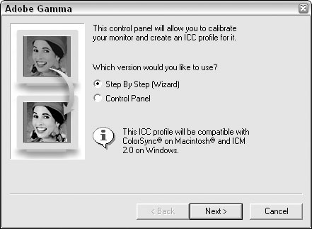
Figure 1: The Photoshop Adobe Gamma utility.
If you're a Mac OS X user, you can use the Display Calibrator Assistant. Choose Apple --> System Preferences --> Displays --> Color. Click the Color tab and then click the Calibrate button. Answer the questions in the Display Calibrator Assistant. (See Figure 2.)
>
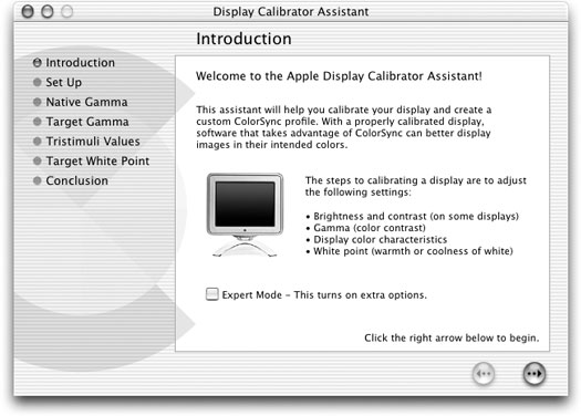
Figure 2: The Display Calibrator Assistant.
Both utilities, Adobe Gamma and the Display Calibrator Assistant, help you remove any color casts and get as neutral a gray background as you can. They also create a profile of your monitor for Photoshop, Illustrator, and other programs so that those applications know how your monitor displays color.
When you calibrate your monitor, display an image for which you already know the color values. For example, use an image that you've worked with and for which you have a good print and then use that image each and every time you calibrate. Your goal is to match the digital image on your screen to the printed image. You should calibrate every so often because monitors can drift and degrade. Some experts say weekly; others are more liberal and say monthly is fine.
You can also find various calibration utilities on the Web. Here are just a few. Do a search and you'll find a ton more.
By the way, not only is letting your monitor warm up a prerequisite before you calibrate, it is also a good idea before you sit down to tackle any image adjustment work.
>
dummies
Source:http://www.dummies.com/how-to/content/color-management-essentials-in-photoshop-cs.html
No comments:
Post a Comment