When you start Lotus Notes 6, you see the Welcome Page. What you see there is determined by a few things. For example, although you can change the Welcome Page layout and contents, you should also know that your administrator has some control over what you see so that he can make sure that you see important announcements and so on.
You can easily change the layout of your Welcome Page. Look at the top center of the Welcome Page for a little triangle immediately preceded by the words Click here for Welcome Page options.Well, you can probably guess that this is what you click to change the look of your Welcome Page. As you can see in Figure 1, there's a plethora of things you can do to make your Welcome Page your very own.
>

Figure 1: Customize your Welcome Page.
In Figure 1, notice that the Current Welcome Page Selection drop-down list has been opened. As you can see in this list, Notes 6 has six Welcome pages to choose from.
- Basics: This configuration is the simplest Welcome Page of all, with those five round main buttons: Mail, Calendar, Contacts, To Do List, and Personal Journal.
- Basics with Calendar: This layout is the same as the Basics except that it also shows your Calendar right in the Welcome Page.
- Headlines with My Lycos: This configuration combines your Inbox with your Calendar as well as a special page from the My Lycos Web site.
- Headlines with UK My Lycos: This layout is the same as Headlines with My Lycos except that the Lycos Web page shows items of special interest to Notes users who are in the United Kingdom.
- Headlines with Terra: This configuration combines your Inbox and your Calendar along with a special Web page from Terra (which is in Spanish).
- Basics Plus: This layout combines your Inbox with your Calendar; it also shows those five big round basic navigation buttons that are on the default Welcome Page as well as a special box that lets you conduct searches.
Your Welcome Page choice is really up to you — you can choose whichever one appeals to you. And because it's so easy to change from one to the other, you might want to use one Welcome Page for a few days to see whether you like it and then switch to another Welcome Page to give it a try, too.
The one distinct advantage to choosing any of the various Welcome pages other than Basics is that you can further customize these other pages by changing what's included in the page. For example, you might decide to use the Basics Plus page but change the contents of the page itself to use your To Do list or perhaps a database that you use instead of the Calendar.
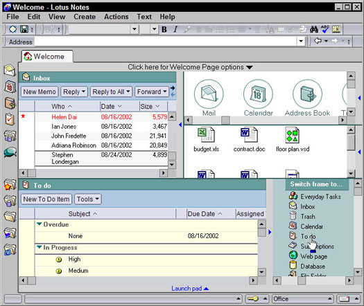
As you can see in Figure 2, each area of the Welcome Page (called frames) has a little triangle (it's blue) midway down its right border. When you click any of these triangles, a Switch Frame To list appears from which you can choose exactly what appears in that frame.
>

Figure 2: Further refine your Welcome Page by changing a frame's contents.
You have several alternatives to choose from the Switch Frame To list. Here's the blow-by-blow on what you can have in a Welcome Page frame and why you might want these items:
- Everyday Tasks: This is another name for those five, big round basic buttons that are part of the default Welcome Page: Mail, Calendar, Contacts, To Do List, and Personal Journal. You can see such a frame in the upper-right corner in Figure 2.
- Inbox: The most common addition to a Welcome Page, this is where your mail comes in. You can see such a frame in the upper-left corner in Figure 2.
- Trash: Select this to display the e-mail messages that you've recently deleted.
- Calendar: Choose this when you want your Welcome Page to show you where you're supposed to be . . . you know, your schedule.
- To Do: This includes your exhaustive list of action items in the Welcome Page.
- Subscriptions: Choose this to mark certain databases and documents in which you're interested; selecting this also automatically displays updates in real-time when these monitored items change.
- Web Page: Select this to include any page — either from the Internet or your company's intranet — in your Welcome Page.
- Database: Choosing this enables you to include any Notes database.
- File Folder: This one is way, way cool: Select this to include a window into one of the folders on your own computer, right in the Welcome Page — what an easy way to get to the files that you use most often. For an illustration of this, check out the middle-right frame of the Welcome Page in Figure 2.
You can also change the layout of a Welcome Page by changing its frame widths and heights much the same way you would change the width of a column in your Inbox. (Hint: Think click and drag.)
If you really aren't smitten with any of the standard six Welcome Page configurations that Notes offers, just create your own. Instead of modifying one of the existing Welcome Page's contents, create a brand new Welcome Page, with almost any layout and contents that you can imagine, by clicking the Create a New Welcome Page. To find this option, just go to the Welcome Page and click the heading Click Here for More Welcome Page Options.
>
dummies
Source:http://www.dummies.com/how-to/content/customizing-the-lotus-notes-welcome-page.html
No comments:
Post a Comment