Figure 1: In the Headde family, a primary focal point out-stages the secondary focal points.
Overlapping for unity and depth
Overlapping objects, or placing some objects over (or in front of) others, unifies a drawing, enhances depth of field, and creates an aesthetically pleasing composition.
Observe your subject carefully before you begin your drawing and plan for places where you can utilize overlapping. To overlap subjects in a drawing, you simply draw closer objects in front of those farther away. For example, if two trees appear side-by-side in a scene, consider drawing them in such a way that one is slightly in front of the other. When you overlap objects, you create a strong three-dimensional illusion.
In Figure 2, the larger child (with lots of hair) is in the foreground (the front), the light haired adult and the baby are in the middle ground, and the dark haired adult (with the grumpy facial expression) is in the distant space (behind the others).
>
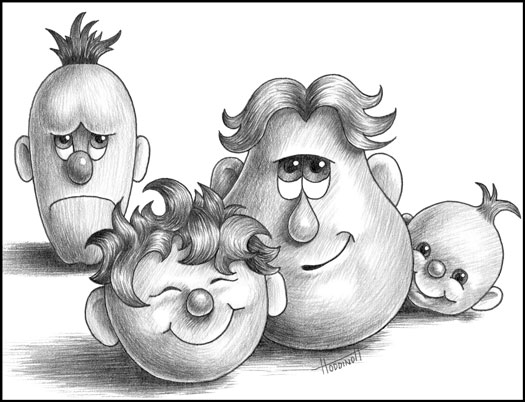
Figure 2: Creating depth by overlapping your subjects.
Using lines to your advantage
In the cartoon drawing in Figure 1, the lines outlining the family members and objects are actual lines. The lines of the steps, on which the largest character is standing, point toward him. But of course, bold black lines, like in this cartoon or a coloring book drawing, do not outline objects in the real world around us.
Representational drawings that include realistic three-dimensional subjects can use implied lines to strengthen a composition. This means lines that are not really there, but are formed (or implied) by the edges of the shapes of the objects in your drawing.
Following the leading line
Effective leading lines can invite and encourage the viewer to enter the drawing space, explore the focal point, and linger to investigate the many facets of the composition.
Either actual lines or implied lines can be used to navigate the viewer around a nonrepresentational drawing. However, in a representational drawing, leading lines are usually implied, rather than actual. For example, in a realistic landscape drawing, a leading line can be a pathway, a river, a row of trees, or a fence. When properly rendered, the eye follows this line (or lines) directly into and through the drawing.
Most viewers begin looking at a drawing in the lower-left hand corner, making this corner the best location for a leading line.
Placing leading lines on the right side of your drawing may take the viewer's eye out of your composition. Also, don't put leading lines exactly in a corner. When a leading line points directly to a corner it forms the shape of an arrowhead, pointing the viewer directly out of the drawing, just as effectively as a big bold neon EXIT sign.
Lining up emotions with composition lines
Various types of lines put diverse emotions and moods in your compositions. Remain conscious of the following effects lines can have in your drawings:
- Curved lines reflect beauty, gentleness, and calmness. The s-curve denotes balance and grace.
- Horizontal lines create stability, peace, and serenity.
- Vertical lines reflect strength, grandeur, and dignity.
- Diagonal lines offer a sense of movement and power. When diagonal lines meet to form an arrow, they can direct the viewer's eye.
Balancing subjects in a composition
Most good drawings result from carefully planning the balance of the various subjects. A balanced drawing is more aesthetically pleasing and harmonious. When creating this balancing act, you must take the sizes, placements, and values of the subjects into account.
Playing with the teeter-totter principle
Think of your drawing subjects on a teeter-totter. If your subjects are the same size, then they balance perfectly with both the same distance from the center point, as in the first drawing in Figure 3. On the other hand, a tiny object on one side balances a larger object on the other end, by being farther away from the center point, as in the second drawing in Figure 3.
>
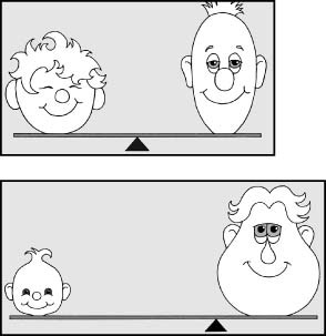
Figure 3: Balancing subjects of the same and differing masses.
Without balance, your drawings may end up visually lopsided and inharmonious. Of course, if you want a particular drawing subject to appear distressing and jarring, using an unbalanced composition can help.
Arrange your objects asymmetrically. Taller objects usually look better off to one side.
Balancing values and shapes
Masses of light and dark values become shapes. These shapes need to be identified and planned before you begin to draw.
Balance dark and light values in your drawing space, in much the same way as objects. Grouping all the dark objects or all the light objects on one side of your drawing space can create a visually lopsided composition. Sometimes simply moving objects slightly to the right or left in your drawing space, or making them lighter or darker than their actual values, can balance the composition.
Placing an odd number of objects into a grouping (rather than an even number) makes a composition more artistically pleasing. Balancing three objects on one side of a composition and five on the other is much more interesting than a static arrangement of four on either side
Delegating proportions to your subjects
When you plan a drawing, you have to decide how big to make each object in the composition. The proportion of each element relative to the others depends on what you want to emphasize in your composition.
It's completely up to you to call upon your creative mind to help you make decisions about the proportions in your composition. Ask yourself the following questions:
- What do I consider to be the most important subject within this composition? The answer to this question may decide what your focal point (center of interest) should be.
- Where should I put my focal point and how much of my total drawing space should my focal point occupy? Many beginners choose to make their focal point the largest object in the drawing.
- How much of my drawing format should be background (negative space)? Negative space is sometimes thought of as a resting place for the viewer's eyes.
>
dummies
Source:http://www.dummies.com/how-to/content/the-design-elements-of-composing-a-drawing.html
No comments:
Post a Comment